
I know, I know… I should be reading Twelfth Night.
But you know me, always playing around the work.
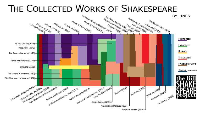
So here’s my latest plaything, an infographic that visually represents the Collected Works of Shakespeare. Each pixel of the full size version represents a line of text. The histories are in shades of purple (royalty, baby), comedies in green (verdant), poems in yellow (no reason), tragedies in red (duh), problem plays in brown (murky, like their genre classification), and tragicomedies in blue (again, no reason, just a vibe).
UPDATE–1/4/15:
A shout-out and thanks to William Sutton, who gave me some information re: the sonnets that changes the legend/content of the graphic.
Hi Bill,
Let it be known there 2155 lines in the sonnets.
sonnet 99 has 15 lines, and
sonnet 126 has 12.
Other than that love your work,
yours in the name of Will,
W.S.
W.S.
Great catch… made an assumption on the sonnets (being a math type, myself)… but I need to remember that ol’ “assume/ass-u-me” idiom (or in this case, “idiot”).
Thanks for the heads-up… when I get a chance, I’ll make the change to that graphic!
bw